Summary
After hearing how much efficient the new Unity DOTS was, I
decided to test it by myself while taking the opportunity to
improve upon a previous project.
In the end, I detected a considerable performance increase,
but the feature it's still lacking support by the engine and
its community, which further slowed down the development.
Specifications
- 50 days half time (4h/day)
- Developed in Unity
- Endless runner game
- UI icons from Material Design Icons
- Plugins used: CodeMonkey Utils, Custom Hierarchy, DoozyUI, Editor Toolbox, Graphy - Ultimate Stats Monitor, In-game Debug Console, LeanTween, PlayerPrefsEditor, Procedural UI Image, TextMesh Pro, Translucent Image - Fast Blurred Background UI, True Shadow UI Soft Shadow and Glow and Ult Events
Project goals
- Getting acquainted with the Unity DOTS
- Improving my previous game Ploppem
Gameplay
The concept around which everything revolves is simple:
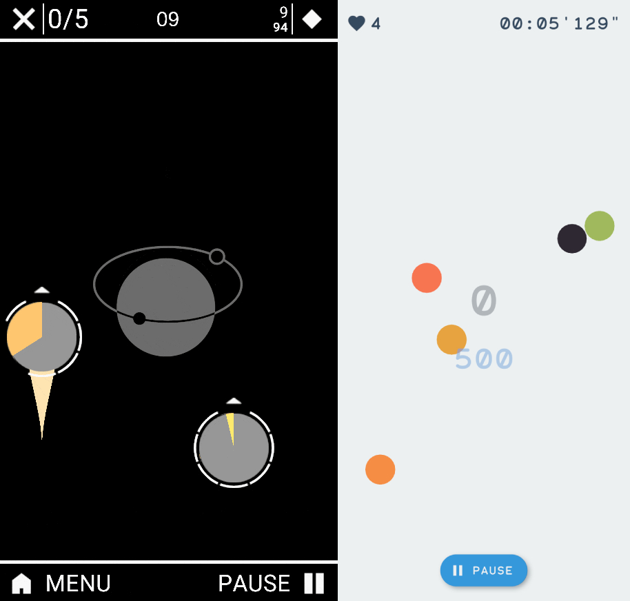
Endless waves of enemies spawn on the screen, touch them, and they will disappear.
If you don't, they detonate by themselves after a specific amount of time, and you lose a heart.
Running out of hearts means Game Over.
But this time, mindful of my previous attempt, I kept the game simple and intuitive, while trying to make it fast and fun.
Enemy design
When it comes to the enemies, much has
improved
from the first game. Gone is their complex AI designed to
avoid a collision between them or their visuals packed with
all sorts of data.
To encourage a
fast reaction
I reduced the enemies to simple shapes, I provided them with a
direction of movement that changes only once they reach the
edges of the screen, and their self-destruct timer is shown in
a gradient from green to red. The enemies can now overlap each
other, but killing more than one at a time does not affect the
points earned.
Difficulty
In Ploppem each time you
killed an enemy, a substitute was queued to spawn after a short
time. The main problem with this approach comes with the long
time the player must wait after eliminating all the enemies on
screen.
To avoid it I separated the spawn from the kill system, and now
the enemies keep coming
independently
from the player performance. Over time the stats of the newborns
become more difficult, keeping the player on the edge of
collapsing. This change also simplified the game design,
therefore opening it to a more
broad
audience.
Coding
By using the new Unity’s Data-Oriented Tech Stack (DOTS), I was
able to further improve the
performances
by replacing the usual MonoBehaviour classes with components in
ECS.
Instead of an enemy object acting independently from the others,
I have now an entity that is just a container for every data
that defines a single enemy. This data is then processed by a
system that efficiently moves each enemy
simultaneously
by using multi-threading processing through a Job. It has
allowed me to introduce the aforementioned independent spawning
system because even with more than 100 enemies on screen, the
fps didn't drop below 60.
The only aspect of the game I was not able to code using DOTS
was the UI.
User Interface
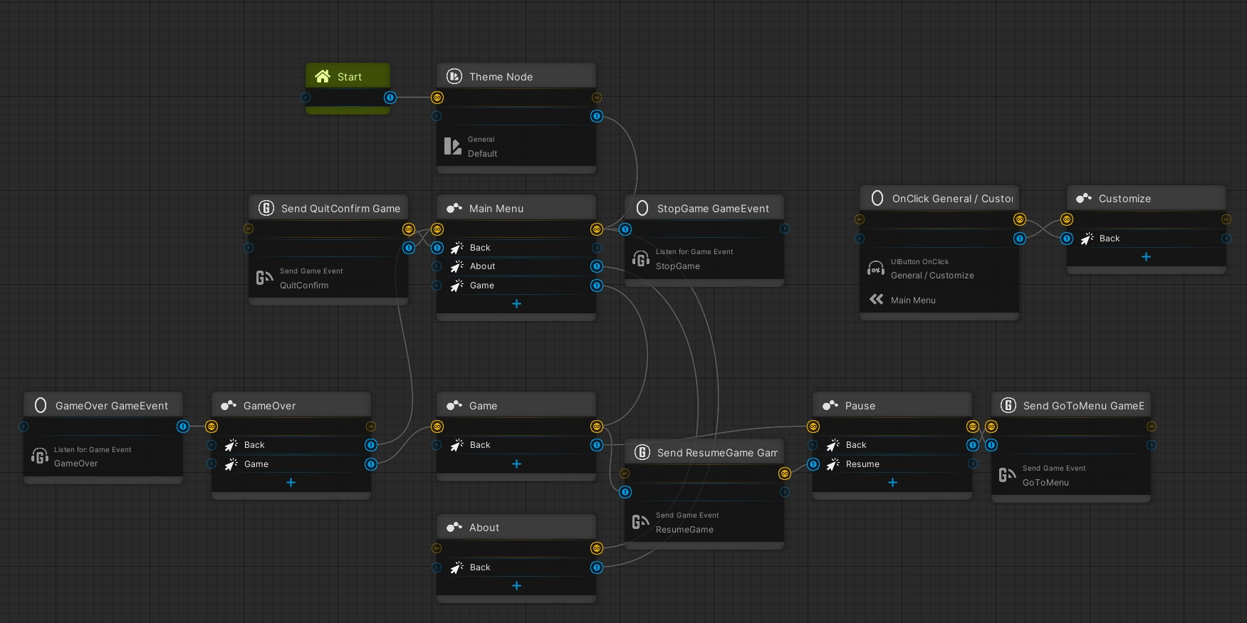
I started implementing the UI of the game using scripts made by myself, carried over from the previous project Tunnel, but while searching for a plugin capable of showing the console in-game, I stumbled across the page Game Assets Free, that allowed me to download various useful plugins, including DoozyUI, a complete management system for the UI. From that point forward I was able to more quickly create all the necessary parts of my interface.
But even if that helped me with the more technical part, I still had to put some effort into the design.
A bit of UX (User Experience)
The interface that was redesigned the most while developing, was the game one.
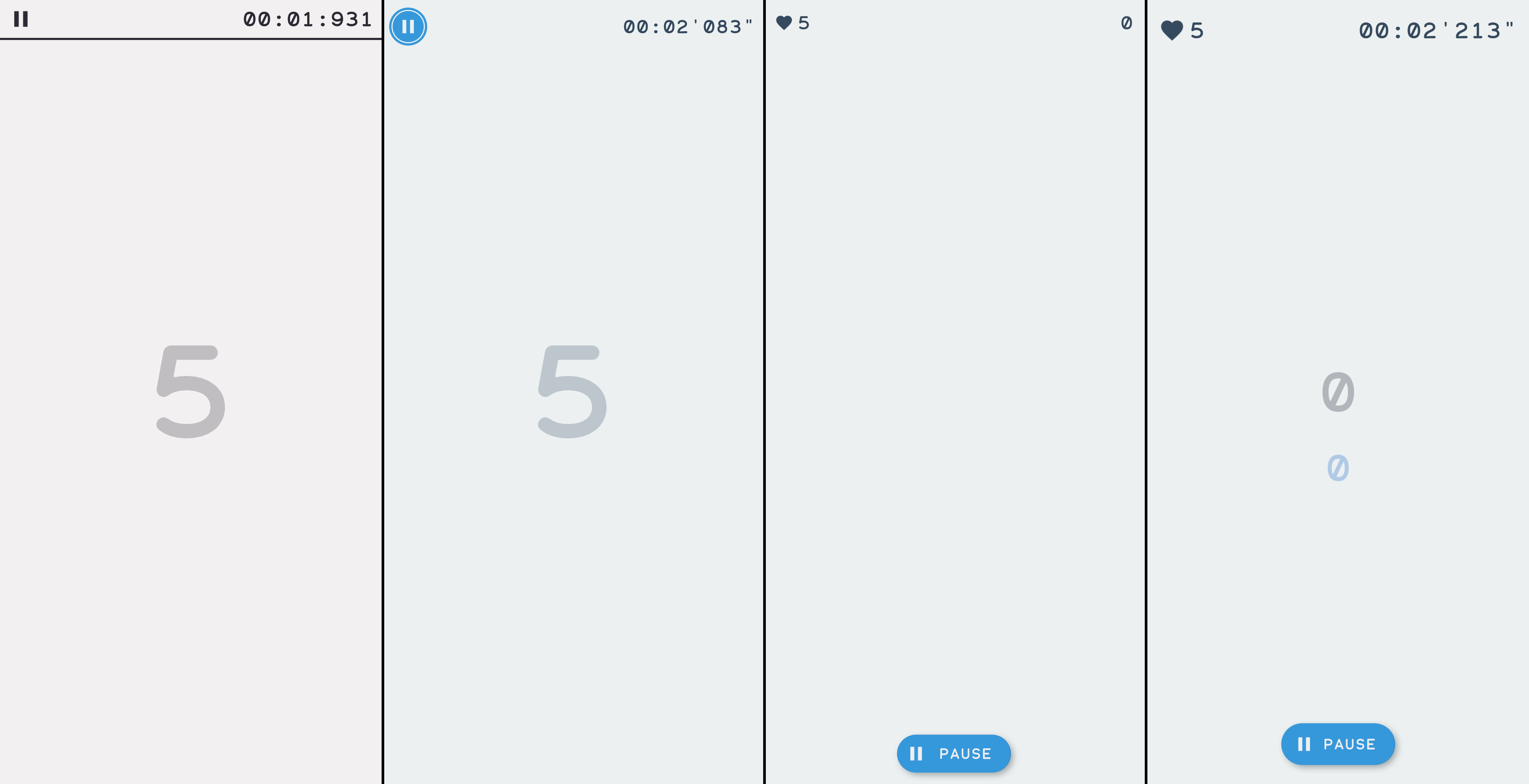
During the prototyping it contained only the pause, a timer
and the remaining lives in the center of the screen.
This didn't change until about the middle of the project,
where I
introduced
the score, and moved the lives to the top right, and in an
attempt to reduce cluttering I also removed the timer. The
pause button has been moved to the center to please both
right and left handed.
After further tests I decided to increase the size of the
texts, reintroduce the timer and then move the score to the
center, adding the highscore (which was previously in the
pause menu), both numbers have an alpha to show the monsters
below.
The main menu also got through quite the change. The
originals 5 buttons (play, customize, about, settings and
game stats) were reduced to 3 for the seek of simplicity.
Both the game settings and the game stats were
relived of
unused functionalities, and incorporated in the main menu. I
then took the game version and author from the about menu
and also putted them in the main menu, leaving only the
social links and credits.
Monetization
To sustain itself, every game needs to generate an
income, and
usually, for Android's games, this comes in the form of a
monetization system. Although
Ploppem 2 didn't need one, I
still theorized how I could implement it.
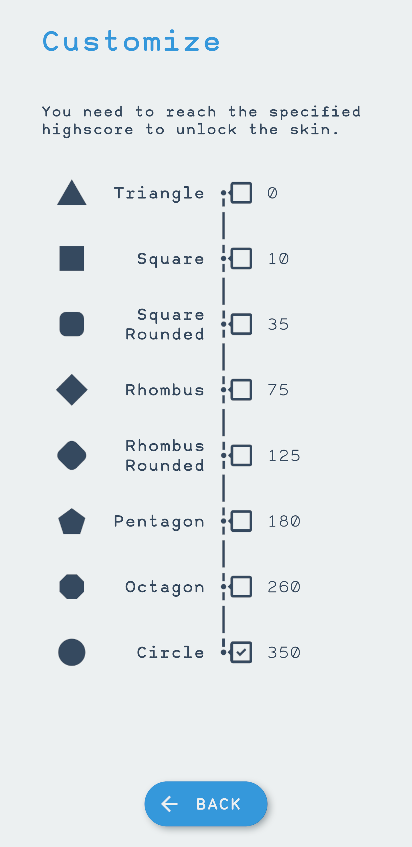
Right now, the game rewards skins to who beats a specific
highscore. They only slightly impact the gameplay difficulty,
based on the skin shape size.
Currency
I would change that by introducing a currency earned by playing, usable to buy the already mentioned skins. Being detached from the player's performance allows introducing higher costs than what can be collected in a single run. Less capable or experienced players should just play more runs. However, it takes time to do so, which brings me to the second and most important addition that makes monetization effective.
Premium Currency
A second currency that can only be
purchased with
real money would allow me to offer those who do not have the
skills or the time some support, in the form of shields or
boosts to help them achieve the same accomplishments as
others.
The addition of other customizations, such as themes for the UI
or different enemies' colours, could also
boost the
monetization, especially if some of them were premium-only.
Closing thoughts
Ploppem 2 was a great opportunity to grow and despite the
difficulties I encountered in adapting to DOP programming, it
allowed me to do justice to one of the first concepts I ever
developed, showing how much I have improved over the years.
However, if I could go back in time I would:
- I would have addressed a few bugs right away, and although I now know they are unsolvable, it would have spared me a lot of headaches towards the end of the project.
- Plugins come in handy to speed up the development process, at the cost of build size and engine performances.


