Summary
This project was an effective proving ground to improve my workflow and overcome my limitations. The extensive use of GitHub and designing the code to maximize its flexibility are two factors that have helped me greatly during development.
Specifications
- 3 months half time (4h/day)
- Developed in Unity
- Puzzle game
- Sprites made in Photopea
- UI icons from Material Design Icons
- Plugins used: TextMesh Pro, LeanTween, Unity Editor Toolbox, Ult Events and Custom Hierarchy
Project goals
- Building a PC game with simple and effective design and a complex technical structure under the surface
- Relying more on GitHub to organize the development and preserve its history
- Developing a modular UI framework reusable in future projects
Game design
As usual I took one of the many ideas I drafted during my educational years. It was something like this:
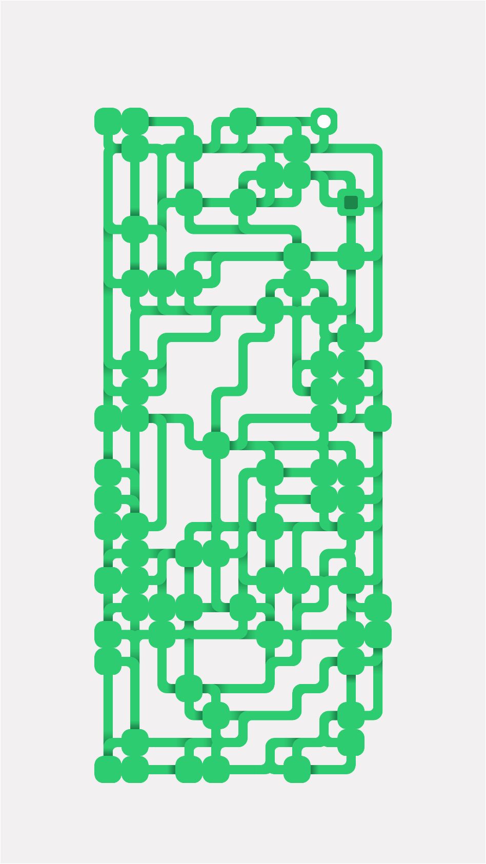
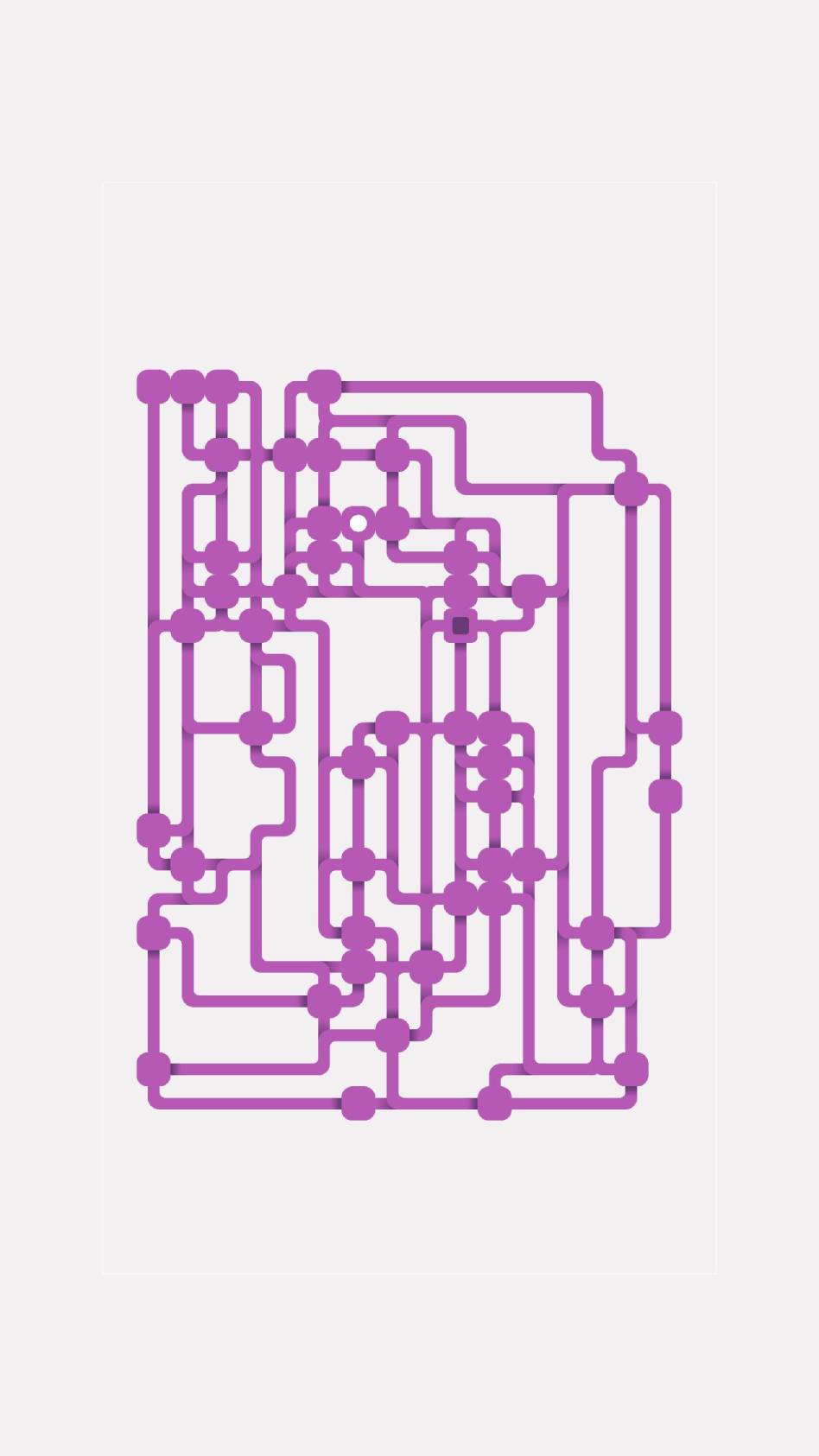
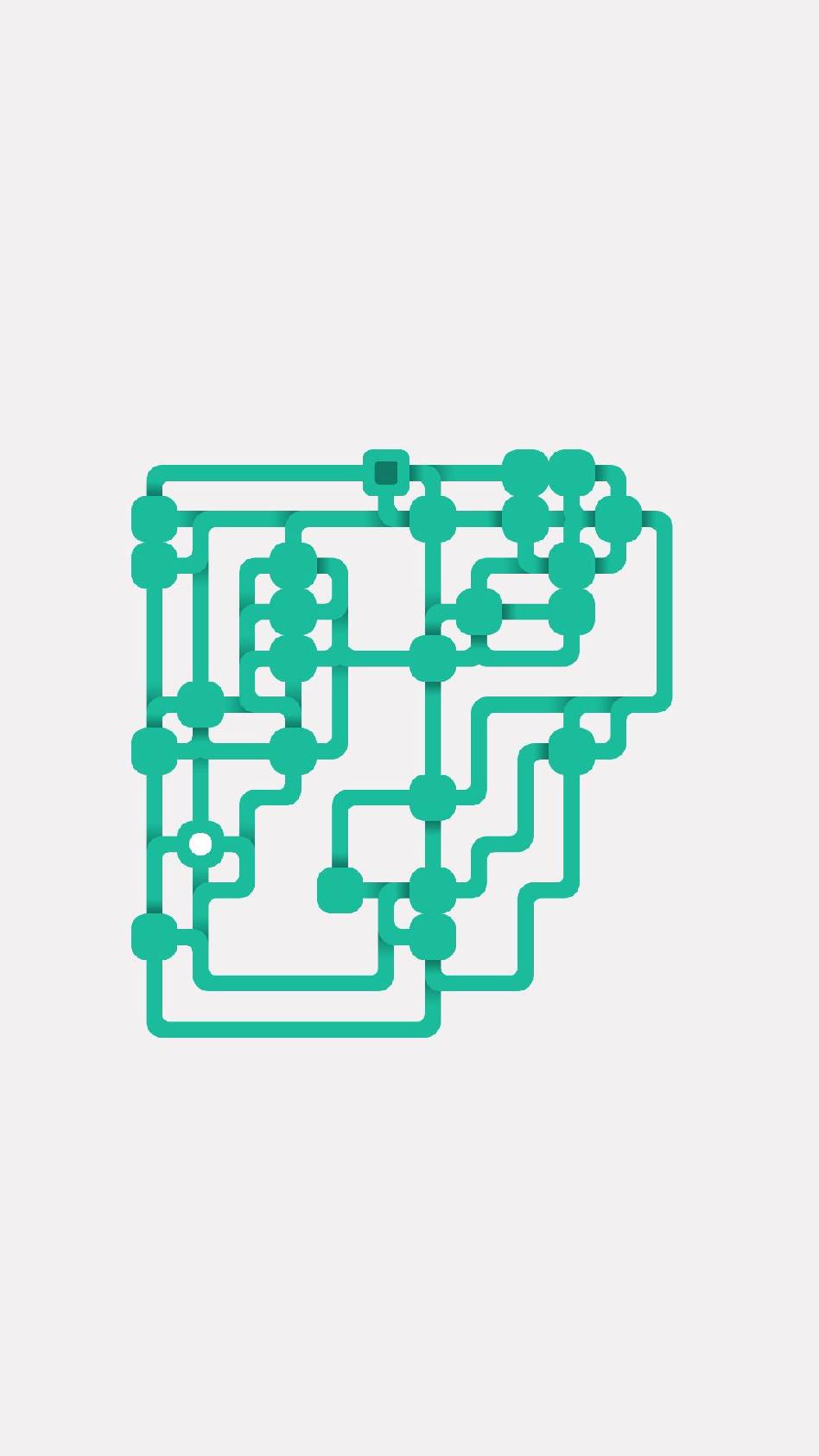
The player is in a maze of square tiles with a direction that forces its movement.
Some tiles, called nodes, allow the player to regain control.
Multiple tiles connected by their directions compose a tunnel.
During the pre-production, after sketching some levels, I encountered 2 unwanted occurrences:
- Reaching a dead end means game-over, as backtracking is impossible.
- A split into a tunnel generates an unsolvable situation since I can't determine the right direction to go.
I solved both issues by managing the generation of levels via a script instead of making them myself. Something that allowed me to experience the use of random generation while also keeping the game design open to later changes and reducing to the minimum the insurgence of human error.
Reach the end
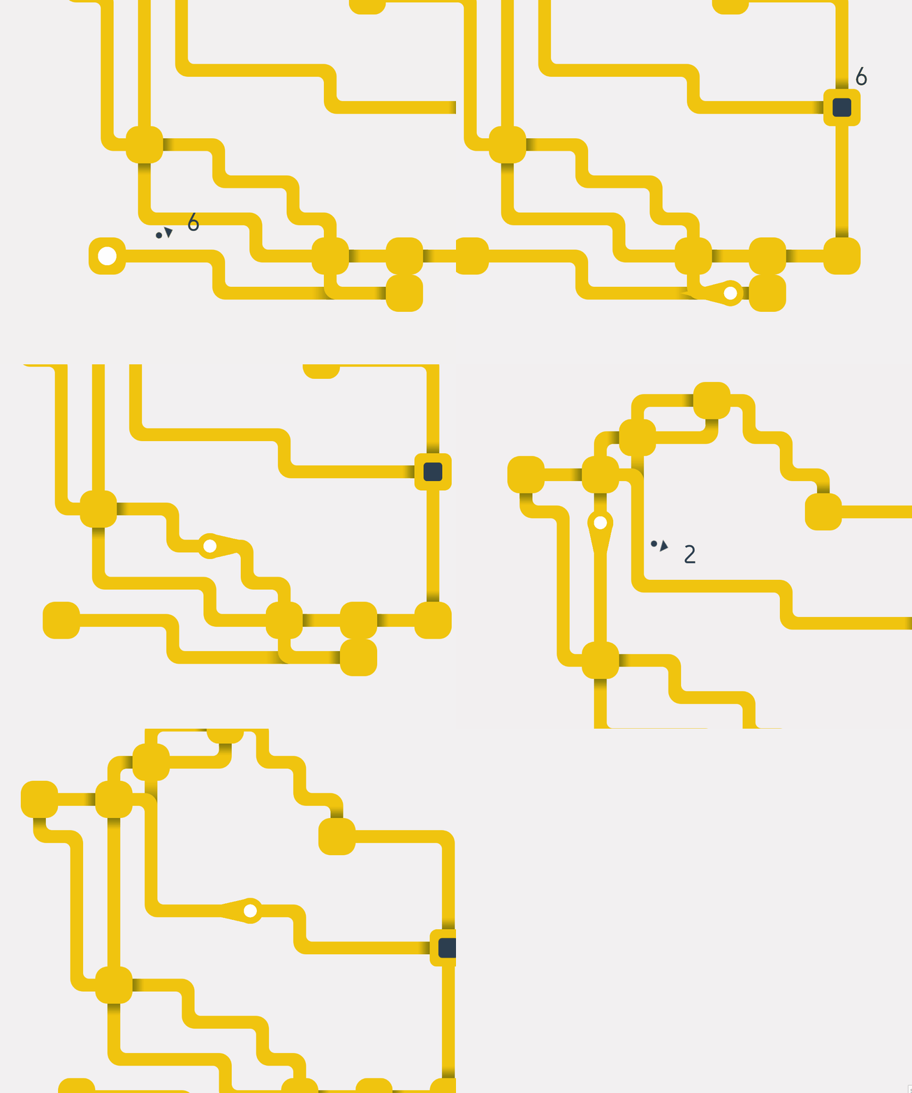
The main and only objective for the player is to reach the end, but its position was originally, making the exploration frustrating, even more since there was no pattern in the generation of the levels.
To solve the issue I showed the end and its entrances from the start, I then later implemented a pathfinding system to tell the player the distance from it, and an arrow to point its position.
All of these systems allow the player to know where the end is. But reaching it is still no easy task since every tunnel can either reduce or increase the distance.
Exploration and patience are the keys to victory.
Level generation
To retain flexibility in the game design, I decided early on to manage the game levels through a random generation algorithm, that will be later implement based on the A* search algorithm, appropriately customized to fit with the other systems.
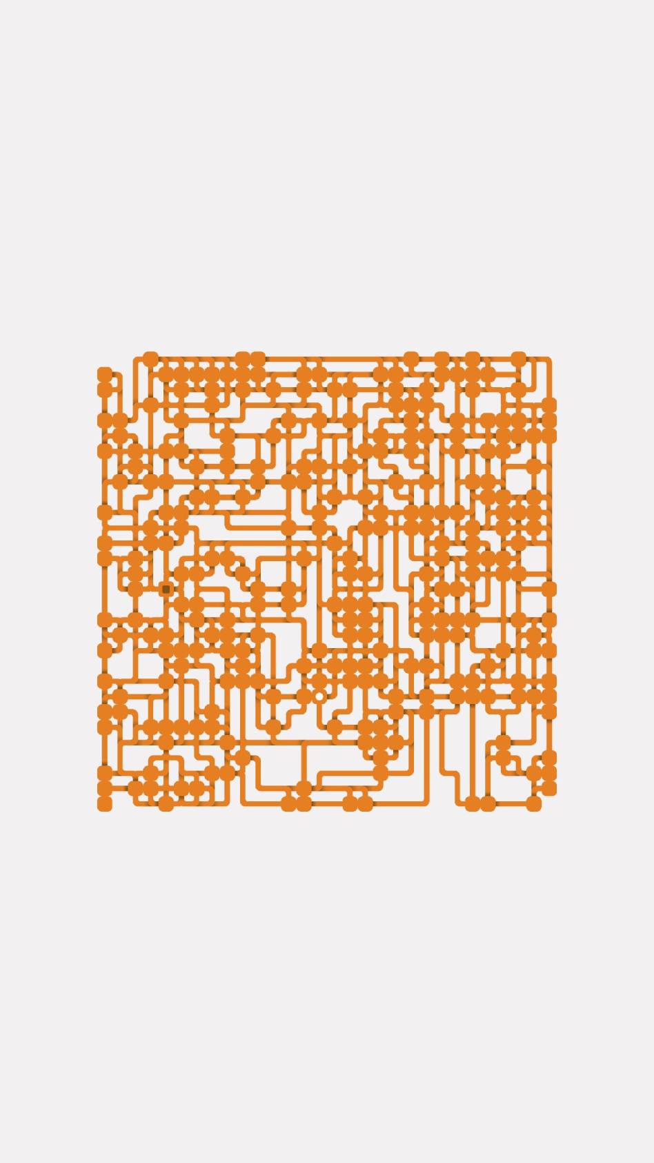
The player can customize the level width, height, and percentage of nodes, and it can also stop the generation process at any time since it is executed in parallel with the main thread to not freeze the game.
The system is designed in phases, each of them must necessarily end successfully, otherwise, the generation is considered failed and is aborted. The player is notified of this and asked to try again. To further reduce the occurrence of this case, I gave each phase some extra attempts equal to about 50% of the cycles it must perform to complete.
Phase 1: Nodes
Chose random tiles and turn them into nodes. There must be at least two for the phase to be a success.
Phase 2: Tunnels
Start looping through all the nodes and connect each of them with the next in the list using the A* algorithm to find a suitable path, if it is not possible try to connect the same starting node with the one after the previous attempt. If less than half of the nodes are being connected this phase is considered failed.
Phase 3: Final touches
Each node that is not connected with another is deleted, then the first is turned into the level start, and the last into the end. Reaching this phase marks the completion of the generation and the new level is then processed by other systems to produce the visuals, spawn the player, etc ...
The Player
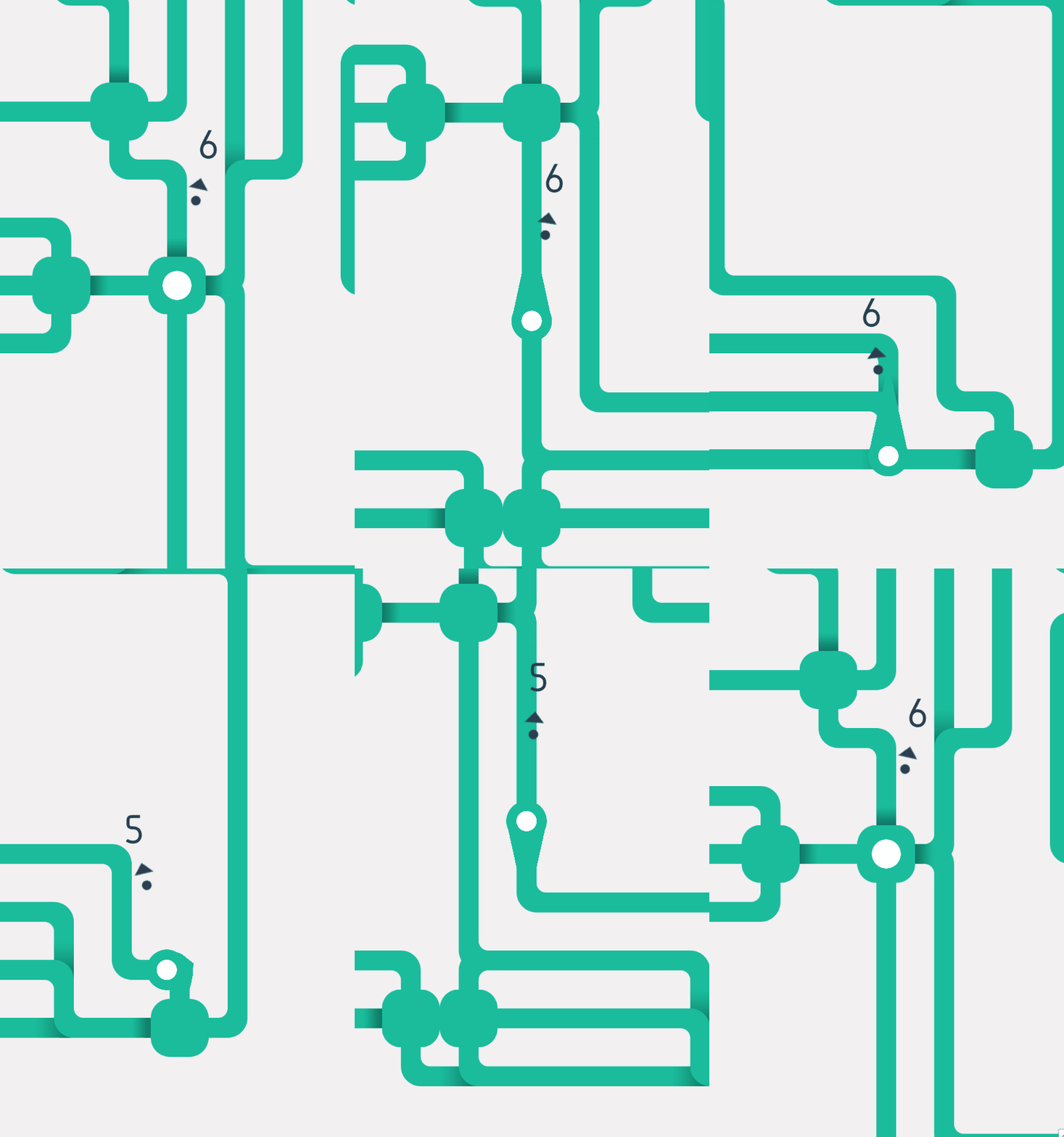
To only way the player can reach the goal is by moving its character (the physical body in the game). Its possibilities are ruled by the tile it standing on. As I previously explained each tile has a direction, represented by an enum field, whose values can be: null, all, up, right, down, left.
For a player to fully complete a movement, both of these conditions must be true:
- Exit condition: The direction is the same as the one of its current tile
- Enter condition: The direction is not opposed to that of the tile in which it wants to move
If the movement is completed and the player enters a new tile, a new check is raised:
- Safe condition: The current tile is a Node
A bit of juice
While zapping on the internet I stumbled across a nice puzzle game called Room to Grow by Mischka Kamener, and I found its UX fantastic, so I decided to take inspiration from it and I implemented a little bounce that shows the player when a direction is not valid.
To make this possible I made the distance the player travels to go to a node (which is usually equal to the distance from the current node to the next), an editable variable. If the direction is not valid I perform the movement anyway, but only for a fraction of it (about a third), and when it is completed I return the player to its original position, therefore generating a bounce-like animation via code. It will not trigger if the player is in a tunnel.
Simple and effective art
During the game development, I tested various art styles, such as pixel art for example, but I settled to doing easy-to-read sprites made with vector graphic.
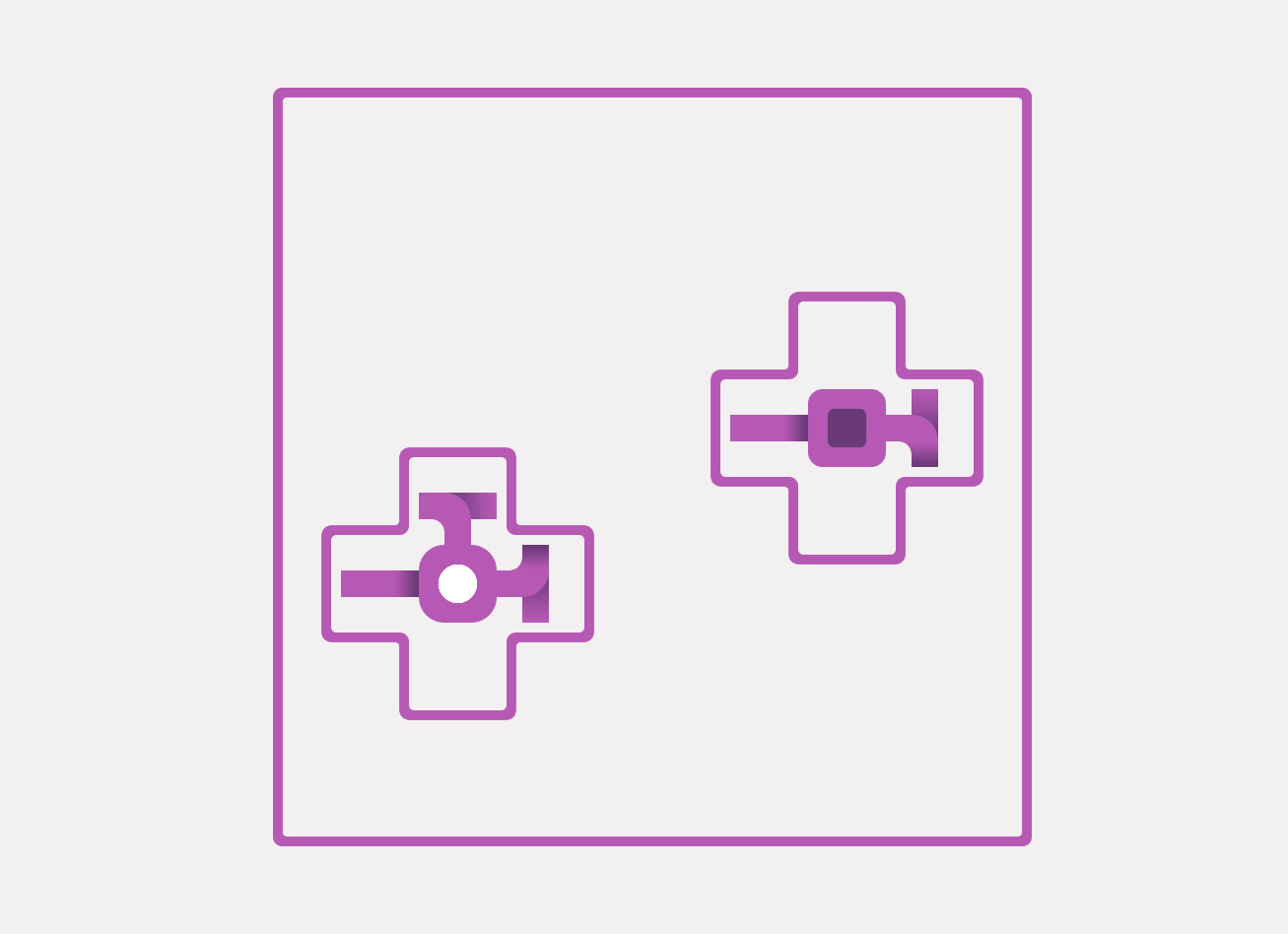
Initially, the tiles had an arrow showing their direction, but I soon discovered that it overwhelmed the player with too much information, such as in a straight section.
Then I found out the marvelous game Mini Motorways by Dinosaur Polo Club, and its use of shadows to highlight the high ground. I then just repurposed the trick to intead shows to the player in which directions it can't go.
The level

The level is built using 2 Tilemaps, one for the visuals and the other for the fog-of-war, the first composed of custom RuleTiles that I programmed to communicate directly with the level manager. I concluded that the Tilemap was the best tool after numerous attempts to develop a similar but more simplified version called GridXY which I then reused to store the data of a level.
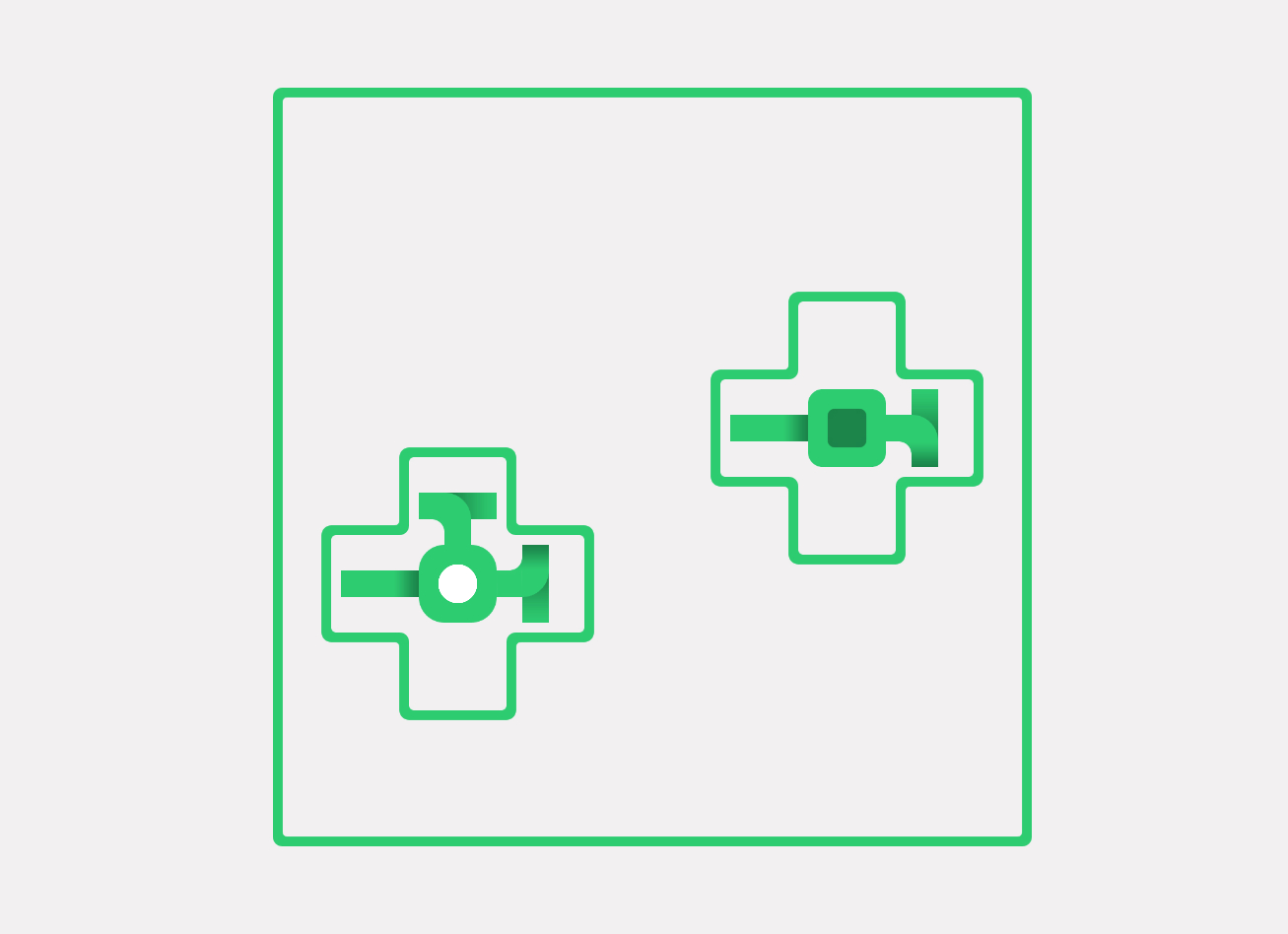
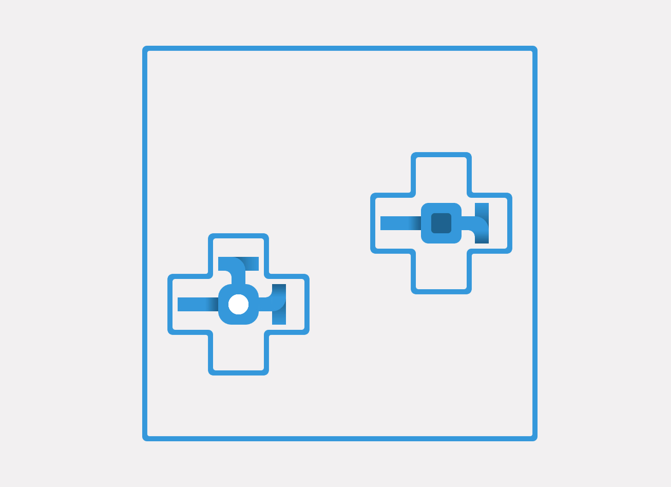
To add variety to the player experience, I've added an auxiliary system that changes the game's palette every time the main menu is visited.
The fog
One of the main mechanics of the game, fog-of-war hasn't gone through many changes. Each tile can be visible or hidden, and towards the end of development also ready to visible, a middle state I had to implement to allow the discovery of a group of empty tiles once all the tunnels surrounding it are visible. Following some feedback, I also added a small animation to improve the effect and to increase the player's reward for exploration.
On a technical level, it was challenging to make the level visuals to communicate with the fog, but apart from that, the use of the default RuleTile together with standard sprites allowed me to support all the possible variants, as you can see from the GIF below.

Closing thoughts
This project has been a considerable challenge and I learned a lot while trying to fulfill its scope, which grew larger each day. Despite this, I am satisfied to have completed it and to have discovered new strategies and features to use in my next works. However, if I could go back in time I would:
- Design my code with performance in mind from the beginning. Once you go deeper it's hard to restructure a project, and the slowness in my level generation shows how much it can effect the end user.
- Iterate more often in order to spot problems quickly, because producing a demo every 3-4 weeks is not frequent enough.
- Avoid trying to rediscover the wheel by developing my own solutions to problems that have already been solved, and instead spend more time adding all those simple details that go a long way in improving the player experience.
